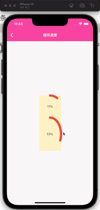
目前实现的效果如下,支持纯色和渐变使用class _CircleProgressPageState extends State { @override Widget build(BuildContext context) { return Scaffold( appBar: AppBar( title: Text( "循环进度", style: TextStyle(), )), body: Center( child: Column( mainAxisAlignment: MainAxisAlignment.center, children: [ CircleProgressIndicatorWidget( width: 100, height: 100, value: 1, gradient: SweepGradient(colors: [Colors.red, Colors.yellow, Colors.red,], stops: [0.3, 0.5, 1]), strokeWidth: 10, totalDuration: Duration( seconds: 10, ), child: (context, c) => Center( child: Text( "${((1 - c.value) * 100).toInt()}%", style: TextStyle( ), ), ), ), SizedBox( width: 100, height: 150, child: CircleProgressIndicatorWidget( value: 0.8, color: Colors.red, strokeWidth: 10, totalDuration: Duration( seconds: 10, ), child: (context, c) => Center( child: Text( "${((1 - c.value) * 100).toInt()}%", style: TextStyle( ), ), ), ), ), ], ), ), ); }}
宽高支持内部赋值或者外部限定,
value 为进度值,范围[0,1],
color与gradient 只能取一个,
child会回调一个函数,用来展示当前的 UI, 返回的是 animationController 的值, 需要相反改一下. 其他就没啥好讲的,随便讲讲我写的时候需要解决的一些小问题吧 问题- 旋转
默认的drawArc是从 X轴顺时针的方向开始,一开始我想着使用-pi/2负角度,但是发现shader渐变无法定制角度,也是从 x 轴开始,然后就想到了旋转图层,将 x轴转到 y 轴,但是这时候要注意
..translate(centerPoint.x, centerPoint.y) // 因为rotate以(0,0)为锚点 ..rotate(-pi / 2) // 旋转90度使起始角为 y 轴 ..translate(-centerPoint.y, -centerPoint.x)
复原的时候x,y 是相反的
2.端点圆角
我一开始为了进度条好看设置了..strokeCap = StrokeCap.round;,但是渐变色的0,1重合位置十分突兀,一度想着放弃渐变的原点了,后来是决定用渐变的数组尾部插一个跟头部相同的颜色来增加好看度,这个需要使用者自己注意下
3.圆弧rect
圆环的宽度中心点正好在 Size的边界,如果读者想要完全限制这个半径的外半径贴合 rect 的宽高,需要自己平移一下中心店,然后减少一个 strokeWidth / 2的宽度,这个其实也很简单 我就不写了,剩下的直接贴代码 源码import 'dart:math';import 'dart:ui' as ui;import 'package:flutter/material.dart';import 'package:flutter_psd/common/utils/psdllog.dart';typedef CircleProgressIndicatorChildBuilder = Widget Function( BuildContext context, AnimationController animationController);class CircleProgressIndicatorWidget extends StatefulWidget { /// 进度值 0~1 final double value; /// 纯色) final Color? color; /// 渐变 final Gradient? gradient; /// 线宽 final double? strokeWidth; /// 子控件 final CircleProgressIndicatorChildBuilder? child; /// 转完一圈需要的总时长 final Duration totalDuration; /// 宽 final double? width; /// 高 final double? height; CircleProgressIndicatorWidget({ Key? key, required this.value, required this.totalDuration, this.color, this.gradient, this.strokeWidth, this.child, this.width, this.height, }) : assert((color != null && gradient != null) == false, "error: 纯色,渐变只能有一个"), super(key: key); @override _CircleProgressIndicatorWidgetState createState() => _CircleProgressIndicatorWidgetState();}class _CircleProgressIndicatorWidgetState extends State with SingleTickerProviderStateMixin { late AnimationController animationController; double get _animateValue => animationController.upperBound - animationController.value; @override void initState() { super.initState(); animationController = AnimationController( vsync: this, lowerBound: 0, upperBound: widget.value, duration: widget.totalDuration * widget.value, ) ..addListener( () { setState(() {}); }, ) ..repeat(); } @override void dispose() { animationController.dispose(); super.dispose(); psdllog('$runtimeType被释放了'); } @override Widget build(BuildContext context) { if (_animateValue == animationController.upperBound) { // 到了最高点 return Container(); } return AnimatedBuilder( animation: animationController, builder: (BuildContext context, Widget? child) { return Container( width: widget.width ?? double.infinity, height: widget.height ?? double.infinity, color: Colors.amberAccent.withOpacity(0.3), child: CustomPaint( painter: _CircleProgressPainter( value: _animateValue, color: widget.color, gradient: widget.gradient, strokeWidth: widget.strokeWidth ?? 10, ), child: widget.child != null ? widget.child!(context, animationController) : null, ), ); }, ); }}class _CircleProgressPainter extends CustomPainter { late Paint _paint; /// 0-1 double value; Color? color; Gradient? gradient; double strokeWidth; _CircleProgressPainter({ required this.value, required this.strokeWidth, this.color, this.gradient, }) : super(); @override void paint(Canvas canvas, Size size) { var centerPoint = Point(size.width / 2, size.height / 2); _paint = Paint() ..style = PaintingStyle.stroke ..strokeWidth = strokeWidth ..strokeCap = StrokeCap.round; if (color != null) { _paint.color = this.color!; // _paint.strokeCap = StrokeCap.round; // 端点变圆,当颜色渐变时效果不好,所以最后设置为纯色时才有这个效果 } if (gradient != null) { _paint.shader = ui.Gradient.sweep(Offset(centerPoint.y, centerPoint.x), gradient!.colors, gradient!.stops); // _paint.strokeCap = StrokeCap.round; } canvas ..translate(centerPoint.x, centerPoint.y) // 因为rotate以(0,0)为锚点 ..rotate(-pi / 2) // 旋转90度使起始角为 y 轴 ..translate(-centerPoint.y, -centerPoint.x) ..drawArc(Rect.fromLTWH(0, 0, size.height, size.width), 0, 2 * pi * value, false, _paint); } @override bool shouldRepaint(covariant _CircleProgressPainter oldDelegate) { return value != oldDelegate.value; }}
ps: 因为这个小组件还是比较简单的,所以稍微花了点时间,把传参都抛出去,正式做成一个组件,后面也不知道准备探索啥,可能图层,也可能是 overlay 了,再立个 flag 吧,两天内再一篇,趁着年初活还不多.
更新2022-02-10 14:41:32增加一个参数,是否是顺时针,效果大家自己脑补就好了,默认 y 中心轴为(0,size.height),需要做一点点平移 if (clockwise == true) { // 顺时针倒计时 var transform = Matrix4.identity()..rotateY(pi); canvas ..translate(centerPoint.x, centerPoint.y) // 因为rotate以(0,0)为锚点 ..transform(transform.storage) // 旋转180度 ..translate(-centerPoint.x, -centerPoint.y); }
免责声明:如果侵犯了您的权益,请联系站长,我们会及时删除侵权内容,谢谢合作! |


